Home

Projects
Blog
About me
Contact
L4nc Branding
Art direction
Motion
The Concept
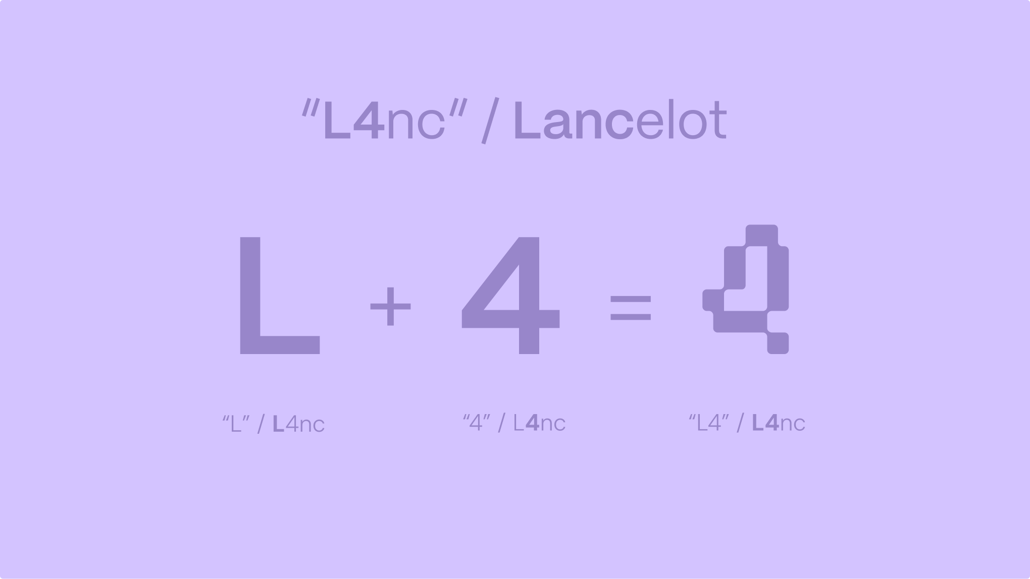
For the overarching visual identity of L4nc Studio, the core objective was to craft a central mark that encapsulates both personal heritage and digital native roots. The symbol itself was born from a deliberate typographic play between letters and numbers. By seamlessly fusing the initial "L" from Lancelot with the numeral "4", the design establishes a direct and clever nod to the established digital signature L4nc. This foundational concept ensures the brand remains deeply personal while projecting a forward thinking and technical aesthetic.
The Structure
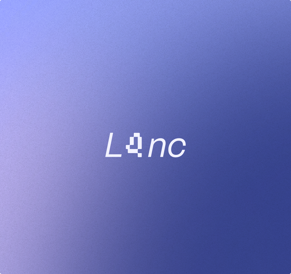
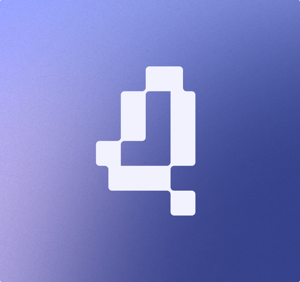
From this alphanumeric combination emerged a highly unique and functional form. The resulting pixel inspired monogram directly reflects the studio's dual commitment to digital creativity and absolute design precision. Every single detail within the mark carries a specific strategic meaning. It relies on a strict modular structure directly inspired by foundational layout grids, ensuring mathematical scalability and balance. Furthermore, the sharp geometric outline perfectly echoes the universal visual language of the digital realm, serving as a visual testament to the studio's experimental spirit.

The Philosophy
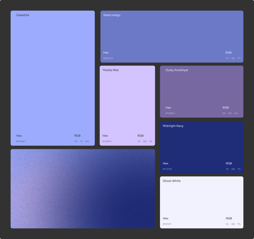
To counterbalance the strict and rigid geometry of the pixel grid, the brand identity incorporates a carefully calibrated soft gradient. This specific chromatic choice intentionally symbolizes the fluid transition between traditional artistic expression and modern technological execution. Ultimately, this mark operates as much more than just a corporate symbol. It represents the complete visual synthesis of the overarching L4nc Studio philosophy. It defines a space where intuitive design seamlessly meets rigorous logic, proving that complex technology can become the ultimate creative tool.


"[Insert inspirational catchphrase here to lure potential clients]"
Contact me
Contact
l4nc@gmail.com
Pages
Home
Projects
Blog
About me
Contact
Social
Tapp.it
Dribbble

2026 L4NC_StudioⒹ All Rights Reserved
L4nc Branding
Art direction
Motion
The Concept
For the overarching visual identity of L4nc Studio, the core objective was to craft a central mark that encapsulates both personal heritage and digital native roots. The symbol itself was born from a deliberate typographic play between letters and numbers. By seamlessly fusing the initial "L" from Lancelot with the numeral "4", the design establishes a direct and clever nod to the established digital signature L4nc. This foundational concept ensures the brand remains deeply personal while projecting a forward thinking and technical aesthetic.
The Structure
From this alphanumeric combination emerged a highly unique and functional form. The resulting pixel inspired monogram directly reflects the studio's dual commitment to digital creativity and absolute design precision. Every single detail within the mark carries a specific strategic meaning. It relies on a strict modular structure directly inspired by foundational layout grids, ensuring mathematical scalability and balance. Furthermore, the sharp geometric outline perfectly echoes the universal visual language of the digital realm, serving as a visual testament to the studio's experimental spirit.
The Philosophy
To counterbalance the strict and rigid geometry of the pixel grid, the brand identity incorporates a carefully calibrated soft gradient. This specific chromatic choice intentionally symbolizes the fluid transition between traditional artistic expression and modern technological execution. Ultimately, this mark operates as much more than just a corporate symbol. It represents the complete visual synthesis of the overarching L4nc Studio philosophy. It defines a space where intuitive design seamlessly meets rigorous logic, proving that complex technology can become the ultimate creative tool.

"[Insert inspirational catchphrase here to lure potential clients]"
Contact me
Contact
hello@l4nc.com
Pages
Home
Projects
Blog
About me
Contact
Social
Tapp.it
Dribbble

2026 L4nc_StudioⒹ All Rights Reserved