Home

Projects
Blog
About me
Contact
Ligne 18
Art direction
A Different Kind of Sports Club
Ligne 18 is a self-initiated brand identity developed as I complete my Master’s degree in Digital Art Direction and wrap up my apprenticeship. It was conceived as more than a logo exercise: I wanted to build a credible brand world, from its strategic starting point to the objects, spaces, and visual behaviours that make a club feel real.
The project imagines an indoor archery club in Marseille, located in a former printing workshop in Belle de Mai. Its ambition is to offer city dwellers a place to slow down, focus, and repeat a precise gesture. Ligne 18 is neither a traditional sports institution nor a novelty activity. It is a contemporary third place, somewhere between a training studio, a cultural club, and a quiet escape.

Eighteen Metres, One Line
The project began with a desire to move away from familiar self-initiated design territories. Running clubs, mountain communities, and coffee brands are all rich subjects, but they appear frequently in contemporary creative portfolios. Archery felt less expected and offered a more singular emotional territory: the silence before release. The name is rooted in the practice itself. Eighteen metres is the official indoor target-archery distance, measured between the shooting line and the target. “Ligne” refers to the physical starting line, the arrow’s trajectory, and the personal axis members come to find again in the middle of a city that rarely stops moving. This idea of alignment became the central principle behind the entire identity.

The Calm Before Release
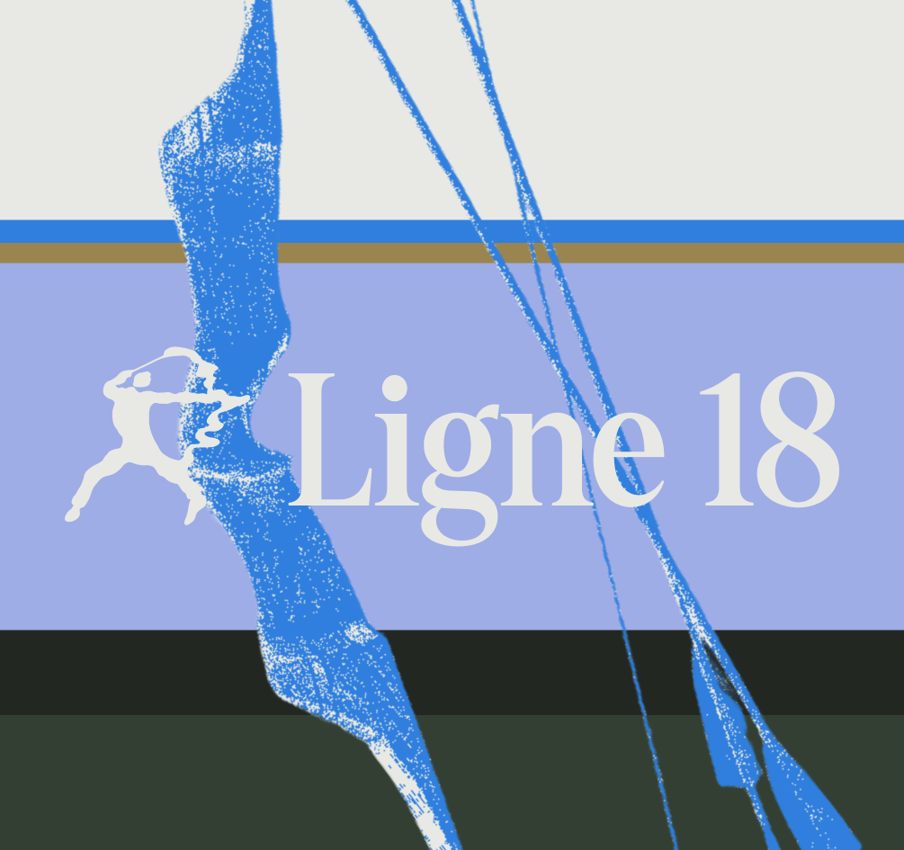
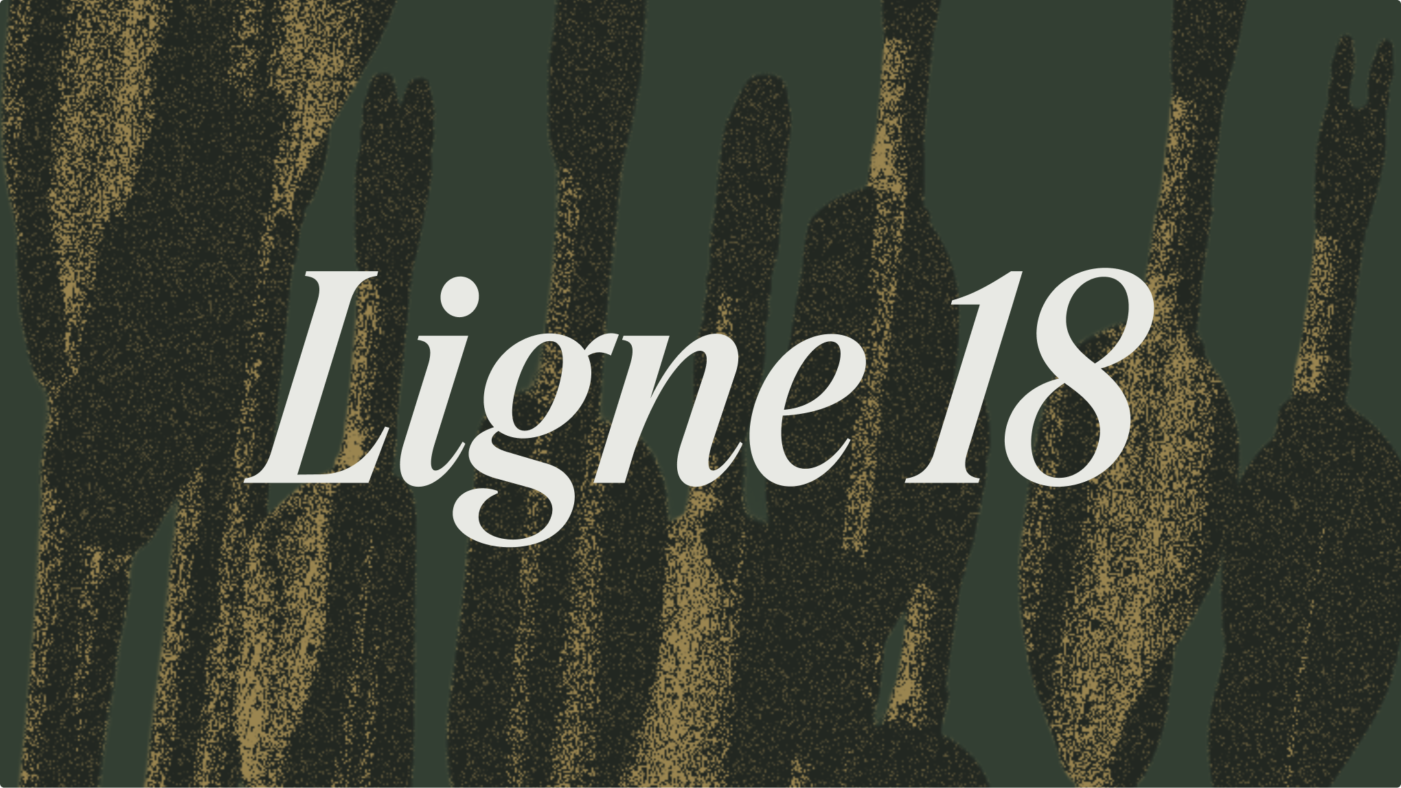
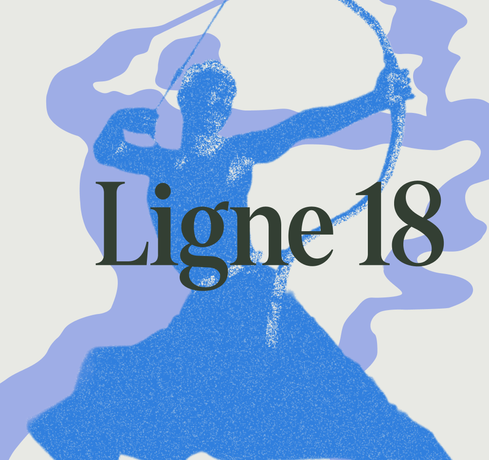
Rather than using archery’s familiar red-and-black target language, the visual system focuses on rhythm, interruption, tension, and breathing space. Layered bands and fragmented trajectories create movement without turning the club into an aggressive performance brand. The colour palette grounds the project in Marseille: azure blue connects the identity to the city and the sea, ochre recalls the mineral light of the Calanques, and deep green makes the club feel like a refuge inside the urban landscape. Lavender introduces a quieter, more nocturnal note for Afterlight, the club’s Friday-night sessions. The archer symbol is freely inspired by a historical photograph of Hong Kong actor Kwan Tak-hing practising archery, taken in the 1950s. His stance, tension, and gesture were distilled into a deliberately raw logomark.
From Identity to Club Culture
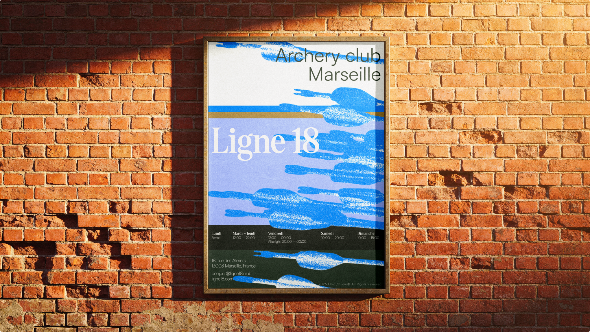
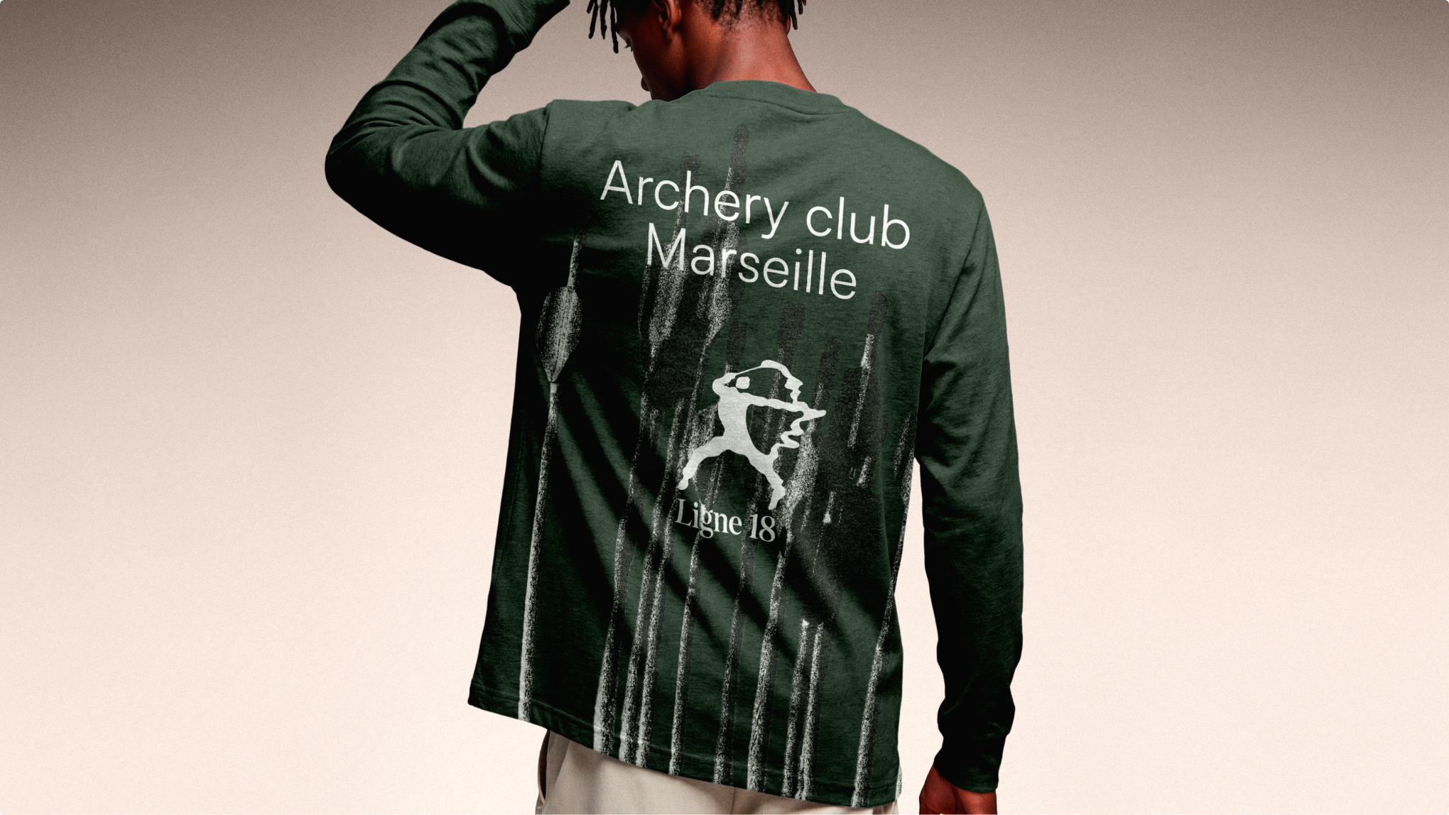
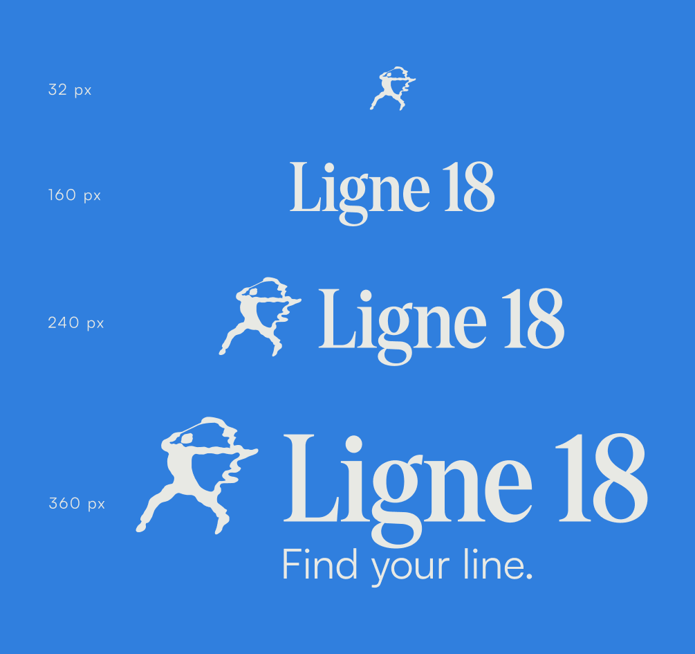
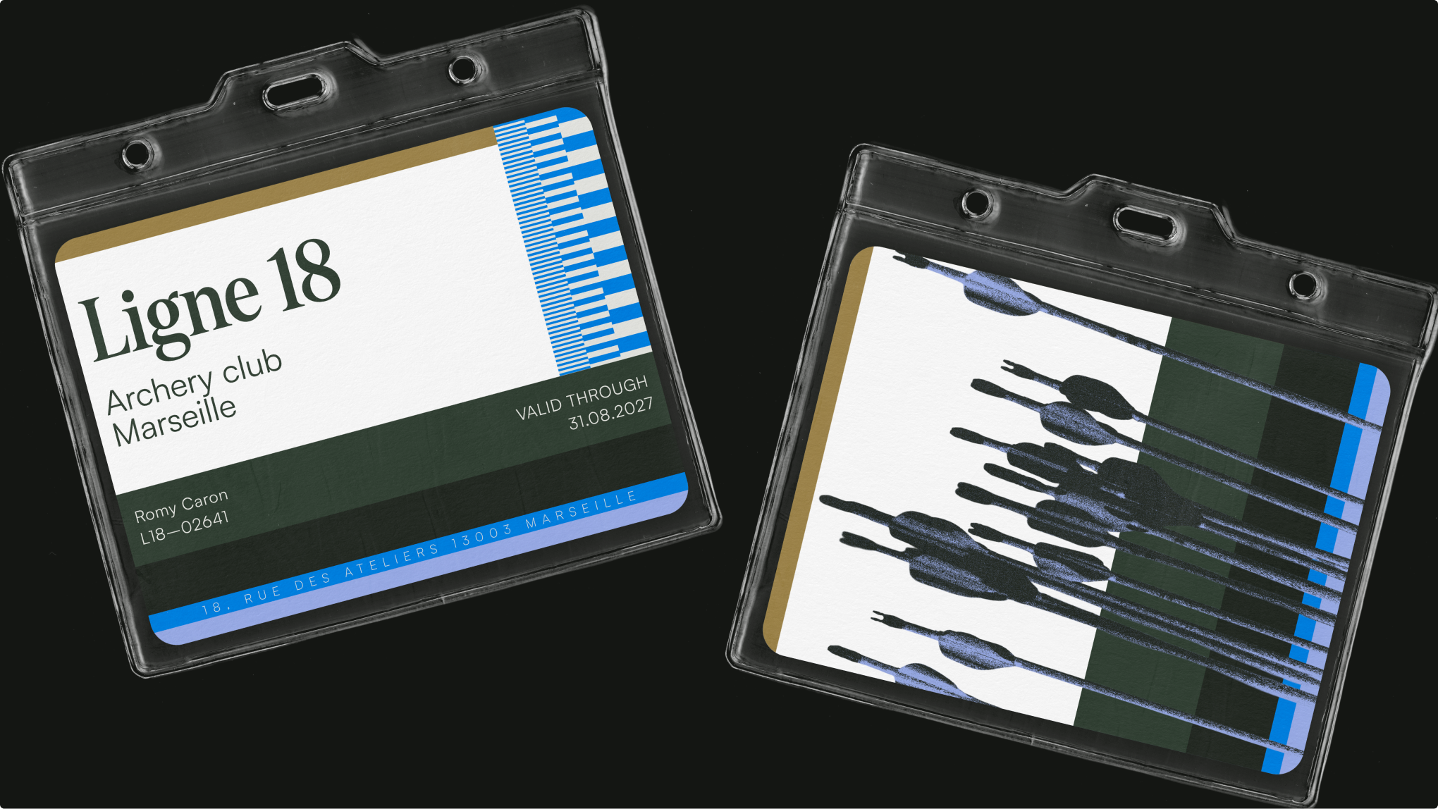
The identity was tested beyond the brand board to prove how it could operate in everyday club life. Posters establish an editorial voice for the physical space, while apparel turns membership into a visible cultural signal. A responsive logo system adapts from a small digital symbol to a full signature, and the membership card gives the club a tangible point of entry.
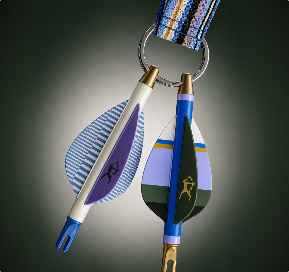
The arrow-nock keychain extends the system into a collectible object, combining colour, material, and gesture at a smaller scale. Each application brings the project back to the same intention: the club does not celebrate the moment an arrow hits its target. It celebrates the few seconds before it. Find your line.


"[Insert inspirational catchphrase here to lure potential clients]"
Contact me
Contact
l4nc@gmail.com
Pages
Home
Projects
Blog
About me
Contact
Social
Tapp.it
Dribbble

2026 L4NC_StudioⒹ All Rights Reserved
Ligne 18
Art direction
A Different Kind of Sports Club
Ligne 18 is a self-initiated brand identity developed as I complete my Master’s degree in Digital Art Direction and wrap up my apprenticeship. It was conceived as more than a logo exercise: I wanted to build a credible brand world, from its strategic starting point to the objects, spaces, and visual behaviours that make a club feel real.
The project imagines an indoor archery club in Marseille, located in a former printing workshop in Belle de Mai. Its ambition is to offer city dwellers a place to slow down, focus, and repeat a precise gesture. Ligne 18 is neither a traditional sports institution nor a novelty activity. It is a contemporary third place, somewhere between a training studio, a cultural club, and a quiet escape.
Eighteen Metres, One Line
The project began with a desire to move away from familiar self-initiated design territories. Running clubs, mountain communities, and coffee brands are all rich subjects, but they appear frequently in contemporary creative portfolios. Archery felt less expected and offered a more singular emotional territory: the silence before release. The name is rooted in the practice itself. Eighteen metres is the official indoor target-archery distance, measured between the shooting line and the target. “Ligne” refers to the physical starting line, the arrow’s trajectory, and the personal axis members come to find again in the middle of a city that rarely stops moving. This idea of alignment became the central principle behind the entire identity.
The Calm Before Release
Rather than using archery’s familiar red-and-black target language, the visual system focuses on rhythm, interruption, tension, and breathing space. Layered bands and fragmented trajectories create movement without turning the club into an aggressive performance brand. The colour palette grounds the project in Marseille: azure blue connects the identity to the city and the sea, ochre recalls the mineral light of the Calanques, and deep green makes the club feel like a refuge inside the urban landscape. Lavender introduces a quieter, more nocturnal note for Afterlight, the club’s Friday-night sessions. The archer symbol is freely inspired by a historical photograph of Hong Kong actor Kwan Tak-hing practising archery, taken in the 1950s. His stance, tension, and gesture were distilled into a deliberately raw logomark.
From Identity to Club Culture
The identity was tested beyond the brand board to prove how it could operate in everyday club life. Posters establish an editorial voice for the physical space, while apparel turns membership into a visible cultural signal. A responsive logo system adapts from a small digital symbol to a full signature, and the membership card gives the club a tangible point of entry.
The arrow-nock keychain extends the system into a collectible object, combining colour, material, and gesture at a smaller scale. Each application brings the project back to the same intention: the club does not celebrate the moment an arrow hits its target. It celebrates the few seconds before it. Find your line.


"[Insert inspirational catchphrase here to lure potential clients]"
Contact me
Contact
l4nc@gmail.com
Pages
Home
Projects
Blog
About me
Contact
Social
Tapp.it
Dribbble

2026 L4NC_StudioⒹ All Rights Reserved
Ligne 18
Art direction
A Different Kind of Sports Club
Ligne 18 is a self-initiated brand identity developed as I complete my Master’s degree in Digital Art Direction and wrap up my apprenticeship. It was conceived as more than a logo exercise: I wanted to build a credible brand world, from its strategic starting point to the objects, spaces, and visual behaviours that make a club feel real.
The project imagines an indoor archery club in Marseille, located in a former printing workshop in Belle de Mai. Its ambition is to offer city dwellers a place to slow down, focus, and repeat a precise gesture. Ligne 18 is neither a traditional sports institution nor a novelty activity. It is a contemporary third place, somewhere between a training studio, a cultural club, and a quiet escape.

Eighteen Metres, One Line
The project began with a desire to move away from familiar self-initiated design territories. Running clubs, mountain communities, and coffee brands are all rich subjects, but they appear frequently in contemporary creative portfolios. Archery felt less expected and offered a more singular emotional territory: the silence before release. The name is rooted in the practice itself. Eighteen metres is the official indoor target-archery distance, measured between the shooting line and the target. “Ligne” refers to the physical starting line, the arrow’s trajectory, and the personal axis members come to find again in the middle of a city that rarely stops moving. This idea of alignment became the central principle behind the entire identity.

The Calm Before Release
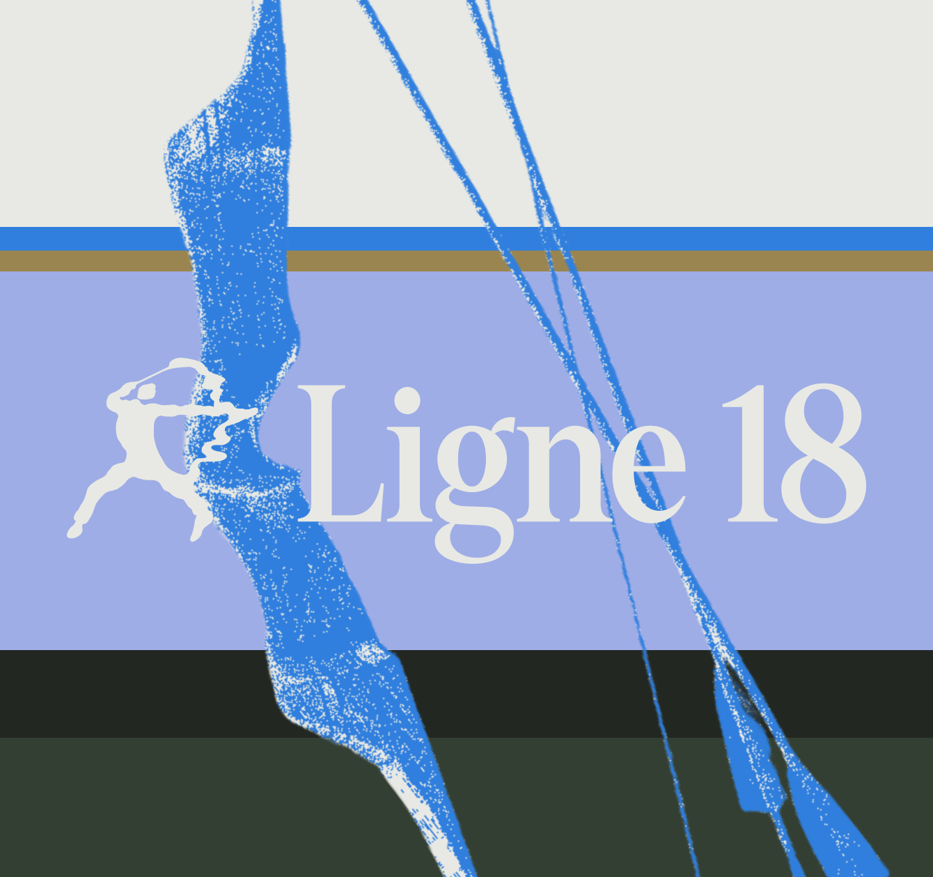
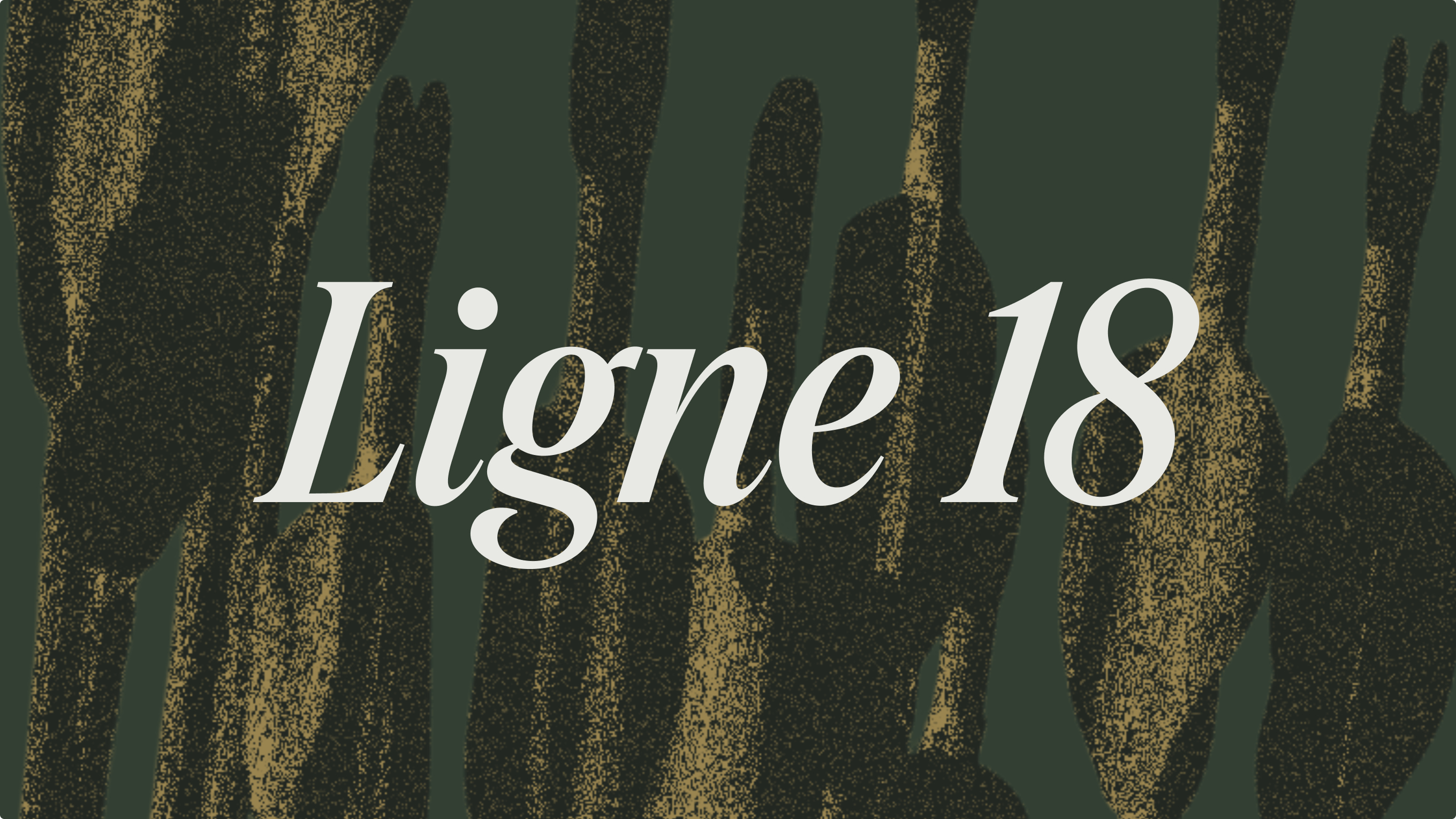
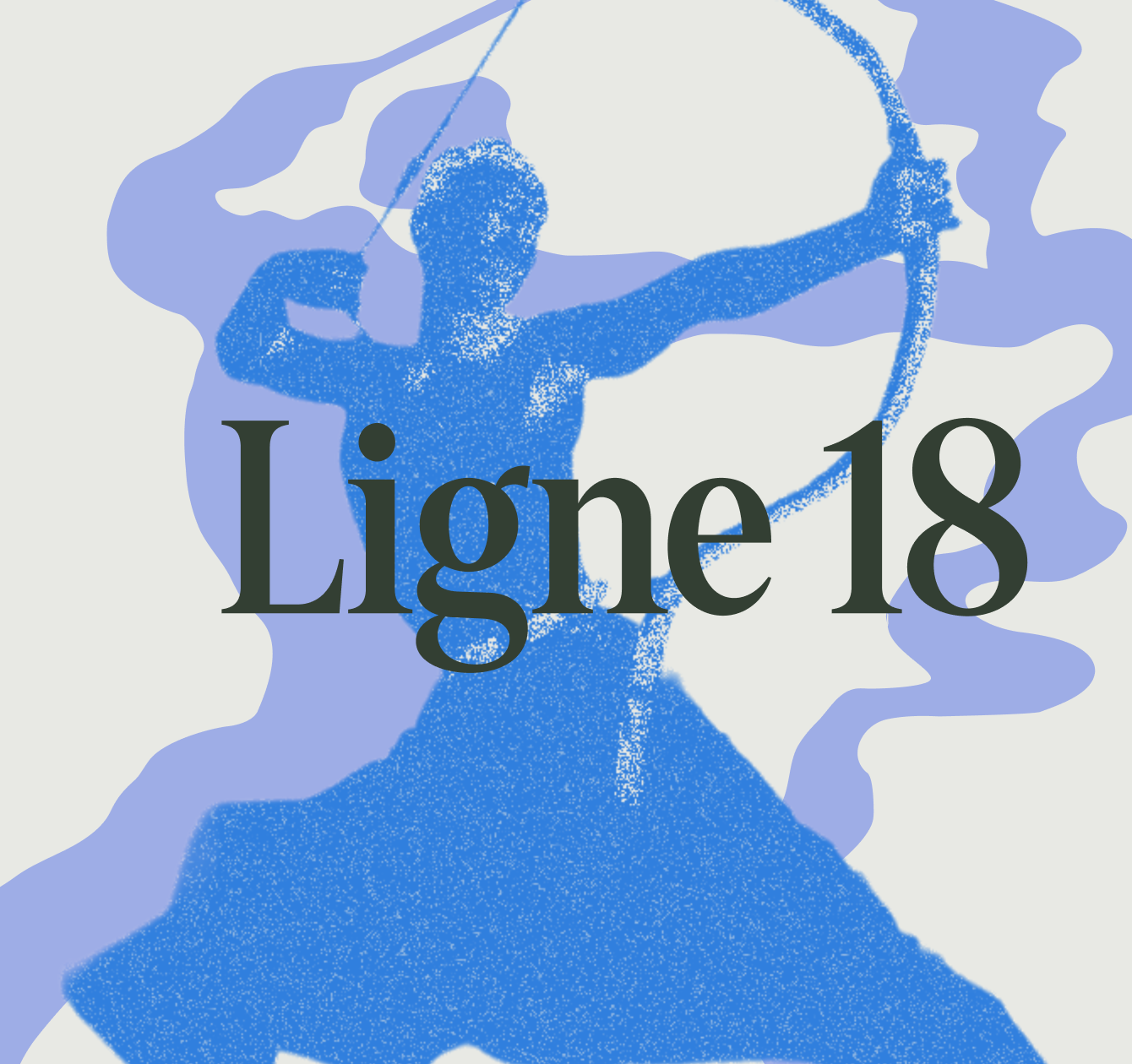
Rather than using archery’s familiar red-and-black target language, the visual system focuses on rhythm, interruption, tension, and breathing space. Layered bands and fragmented trajectories create movement without turning the club into an aggressive performance brand. The colour palette grounds the project in Marseille: azure blue connects the identity to the city and the sea, ochre recalls the mineral light of the Calanques, and deep green makes the club feel like a refuge inside the urban landscape. Lavender introduces a quieter, more nocturnal note for Afterlight, the club’s Friday-night sessions. The archer symbol is freely inspired by a historical photograph of Hong Kong actor Kwan Tak-hing practising archery, taken in the 1950s. His stance, tension, and gesture were distilled into a deliberately raw logomark.
From Identity to Club Culture
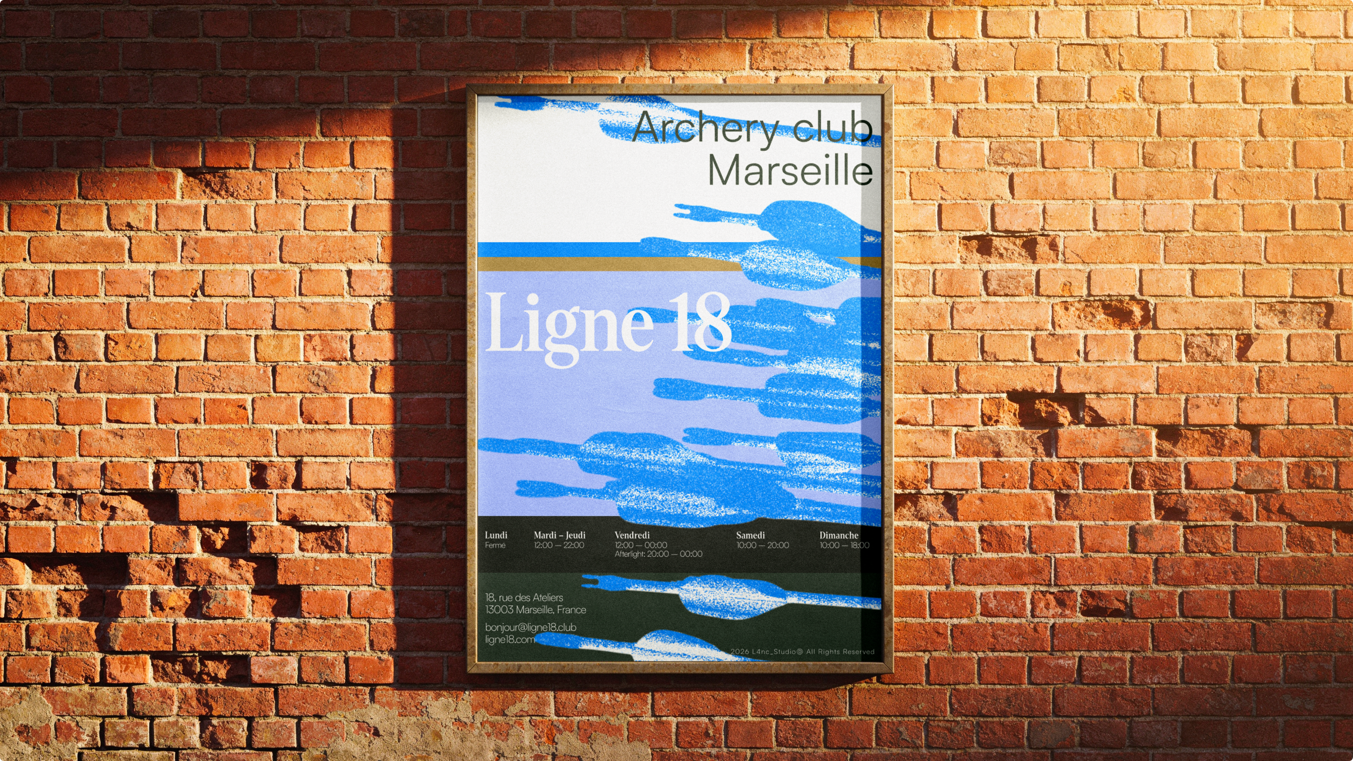
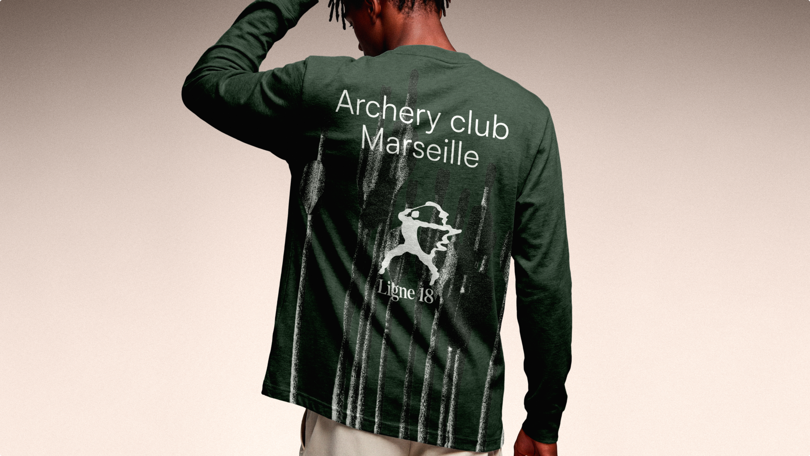
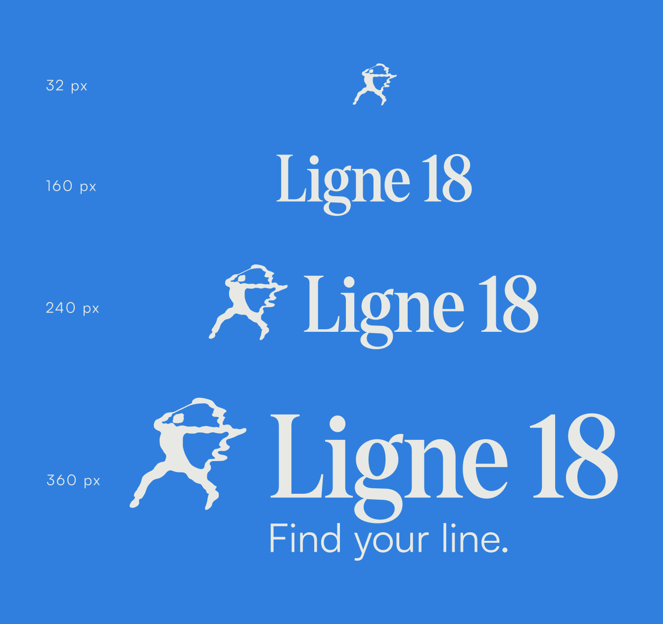
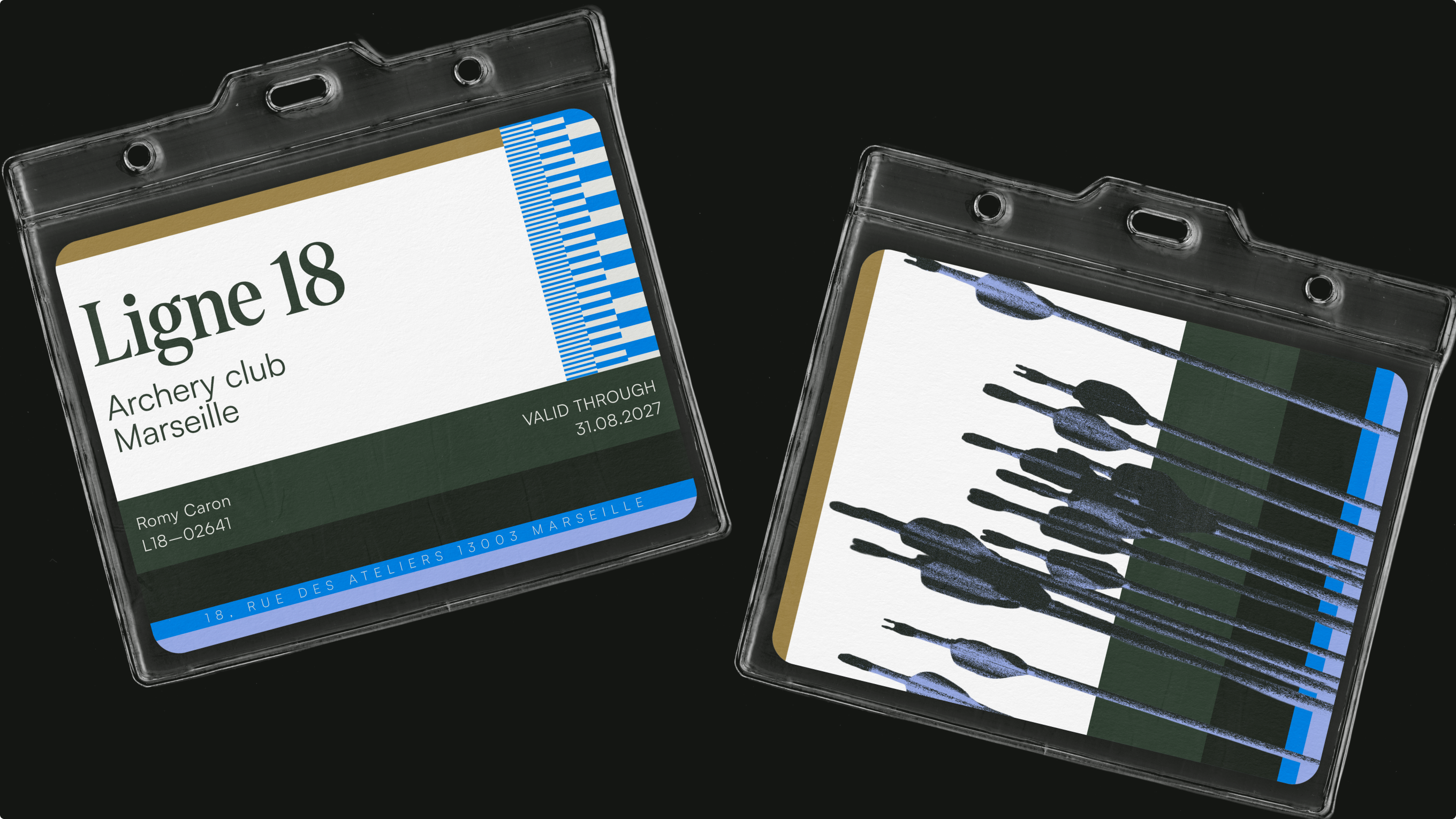
The identity was tested beyond the brand board to prove how it could operate in everyday club life. Posters establish an editorial voice for the physical space, while apparel turns membership into a visible cultural signal. A responsive logo system adapts from a small digital symbol to a full signature, and the membership card gives the club a tangible point of entry.
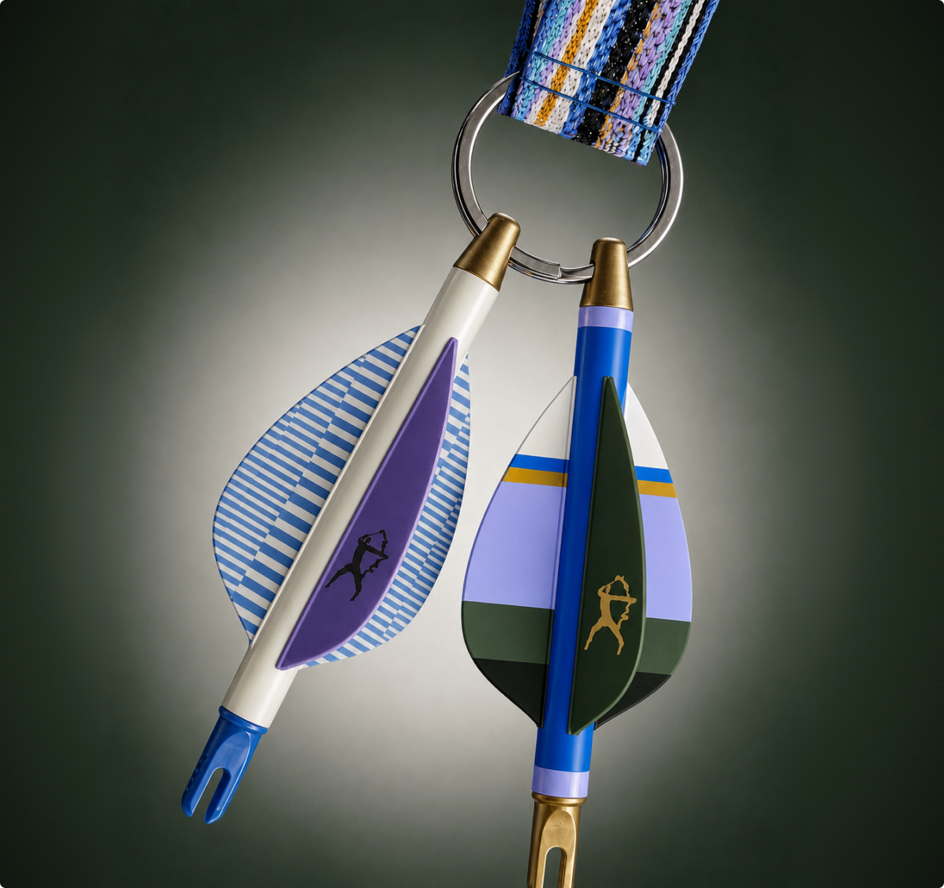
The arrow-nock keychain extends the system into a collectible object, combining colour, material, and gesture at a smaller scale. Each application brings the project back to the same intention: the club does not celebrate the moment an arrow hits its target. It celebrates the few seconds before it. Find your line.

"[Insert inspirational catchphrase here to lure potential clients]"
Contact me
Contact
hello@l4nc.com
Pages
Home
Projects
Blog
About me
Contact
Social
Tapp.it
Dribbble

2026 L4nc_StudioⒹ All Rights Reserved