Home

Projects
Blog
About me
Contact
MERCURY ORBITAL DYNAMICS
Art direction
The World-Building
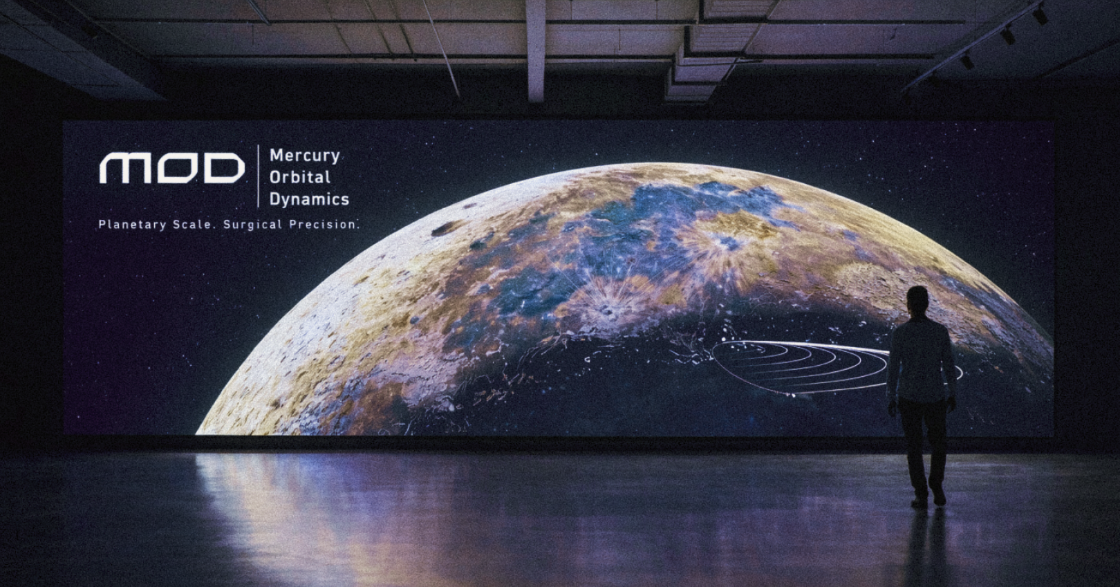
For this second episode of our planetary branding series, we head toward the fastest and most hostile sentinel in the solar system: Mercury. In 2500, this scorched iron world is no longer just a desolate rock. It has been meticulously transformed into humanity's ultimate ballistic testing range.
The Fictional Brief
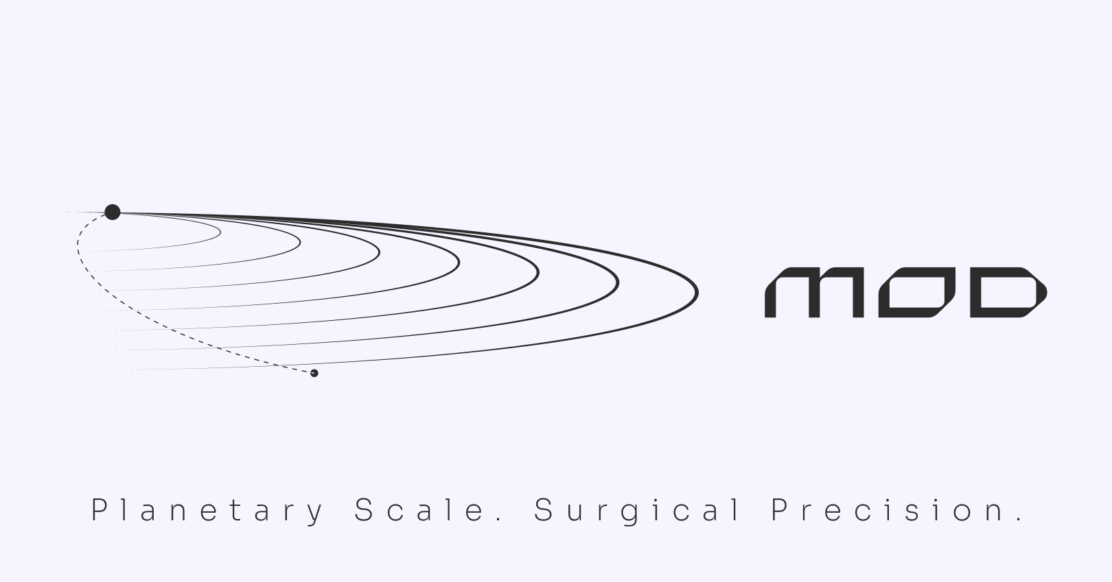
Mercury Orbital Dynamics (MOD) is the sovereign military directorate that claimed this planet. The entity leverages extreme orbital velocity and dangerous solar proximity to calibrate surgical strikes launched from the outer system. It is not simply an arms corporation, it is the final verdict.
The Visual Grid
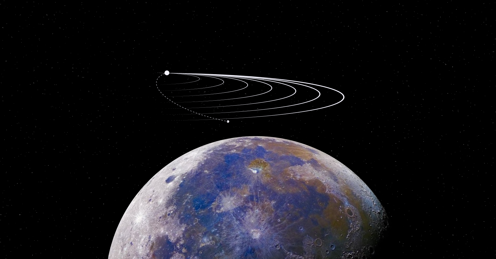
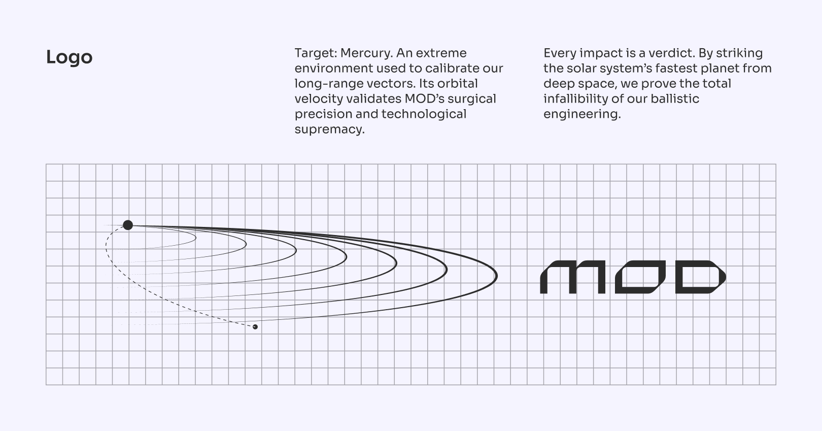
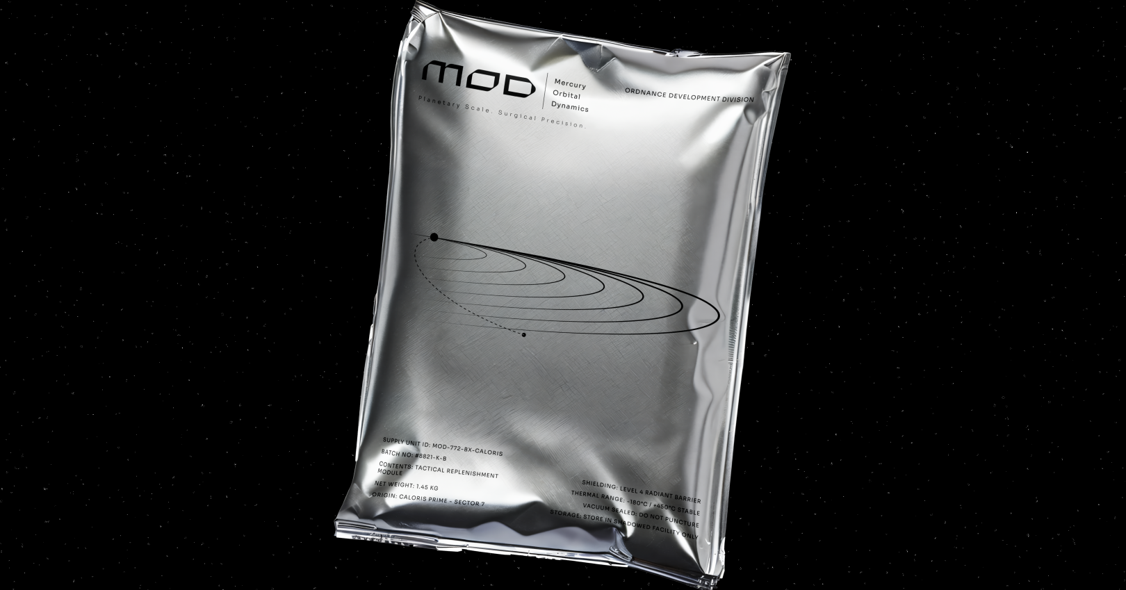
The central challenge was to visually embody inevitable precision within a brutally hostile environment. The graphic system deliberately strips away all warmth and organic influence. Every element is engineered to reflect the harsh reality of deep space warfare and calculated orbital mechanics.
The Colors
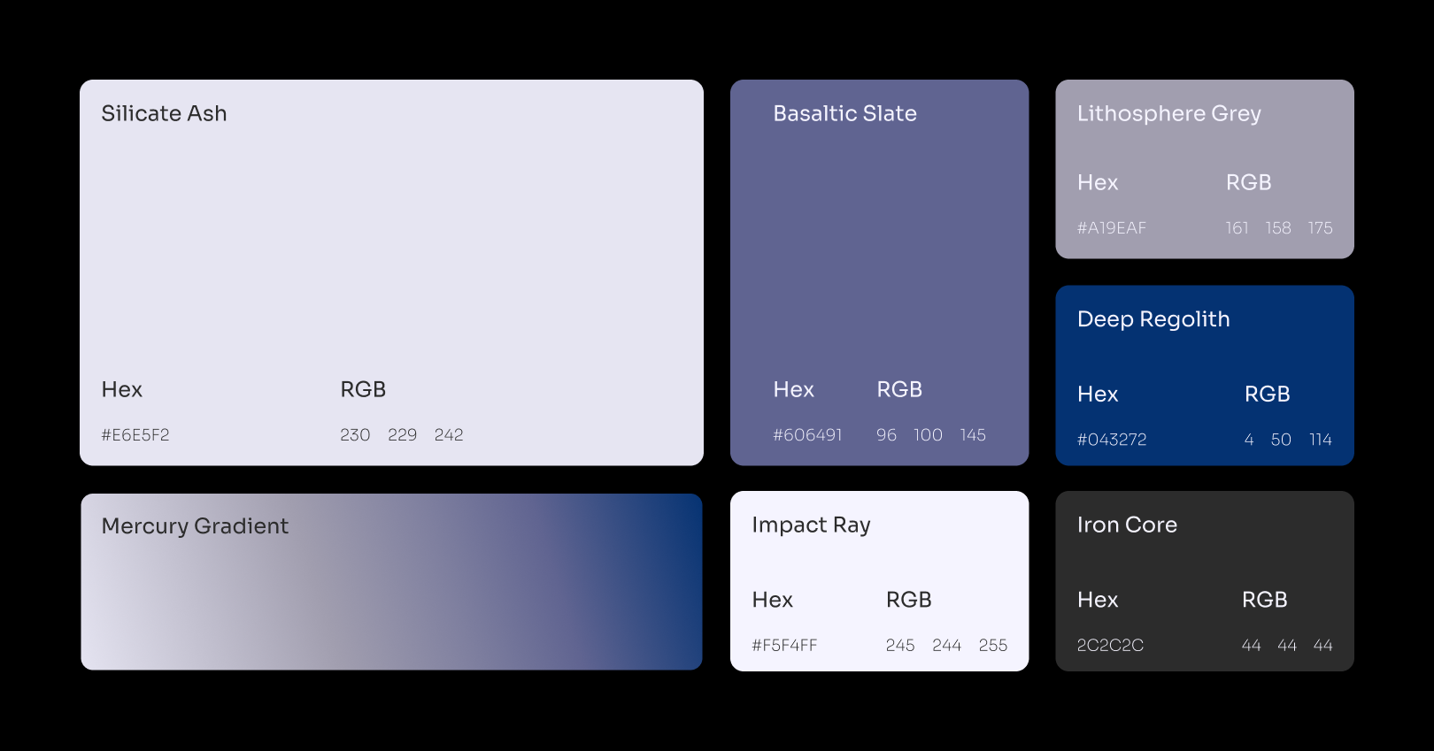
The chromatic strategy is extracted directly from the planetary geology. The palette abandons traditional corporate blues for highly technical tones like Basaltic Slate and Deep Regolith. This selection establishes an aesthetic of ash and metal, just as impenetrable and dangerous as the world it represents.
The Typography
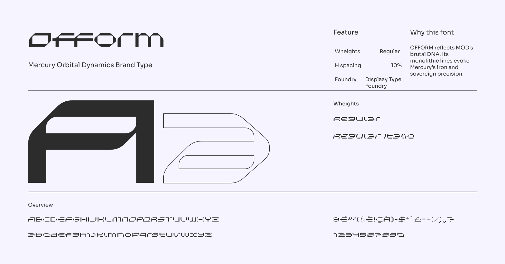
To anchor this aggressive system, I selected the Ofform typography as the structural foundation. Its monolithic morphology and razor sharp angles perfectly reflect the density of the planet's iron core. It finalizes the identity by evoking the unquestionable sovereign rigor of the Mercurian administration.


"[Insert inspirational catchphrase here to lure potential clients]"
Contact me
Contact
l4nc@gmail.com
Pages
Home
Projects
Blog
About me
Contact
Social
Tapp.it
Dribbble

2026 L4NC_StudioⒹ All Rights Reserved
MERCURY ORBITAL DYNAMICS
Art direction
The World-Building
For this second episode of our planetary branding series, we head toward the fastest and most hostile sentinel in the solar system: Mercury. In 2500, this scorched iron world is no longer just a desolate rock. It has been meticulously transformed into humanity's ultimate ballistic testing range.
The Fictional Brief
Mercury Orbital Dynamics (MOD) is the sovereign military directorate that claimed this planet. The entity leverages extreme orbital velocity and dangerous solar proximity to calibrate surgical strikes launched from the outer system. It is not simply an arms corporation, it is the final verdict.
The Visual Grid
The central challenge was to visually embody inevitable precision within a brutally hostile environment. The graphic system deliberately strips away all warmth and organic influence. Every element is engineered to reflect the harsh reality of deep space warfare and calculated orbital mechanics.
The Symbol
At the center of this identity lies the MOD emblem. This logo is not a closed orbit, it is an impact trajectory. It illustrates a system of converging vectors captured by the solar gravity well. Every curve is a calculation, and every impact is an absolute sentence.
The Colors
The chromatic strategy is extracted directly from the planetary geology. The palette abandons traditional corporate blues for highly technical tones like Basaltic Slate and Deep Regolith. This selection establishes an aesthetic of ash and metal, just as impenetrable and dangerous as the world it represents.
The Typography
To anchor this aggressive system, I selected the Ofform typography as the structural foundation. Its monolithic morphology and razor sharp angles perfectly reflect the density of the planet's iron core. It finalizes the identity by evoking the unquestionable sovereign rigor of the Mercurian administration.

"[Insert inspirational catchphrase here to lure potential clients]"
Contact me
Contact
hello@l4nc.com
Pages
Home
Projects
Blog
About me
Contact
Social
Tapp.it
Dribbble

2026 L4nc_StudioⒹ All Rights Reserved