Home

Projects
Blog
About me
Contact
Petal & Stem
Art direction
Illustration
The Challenge & Concept
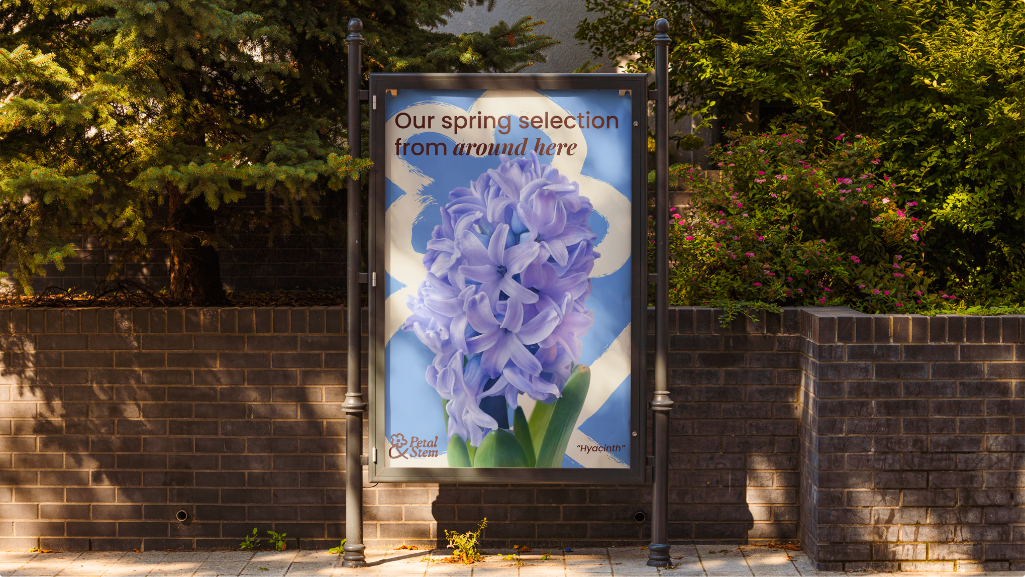
The brief for Petal & Stem called for a visual identity for an independent florist built entirely on friendship and strictly seasonal British blooms. To capture this unpretentious and joyful energy, I developed a "Modern Naive" art direction. It deliberately steps away from polished, traditional floristry clichés to create a grounded, confident brand that celebrates craft and human connection. This specific vision and execution led the project to be highlighted in a dedicated feature by Creative Boom.
Typographic Thinking
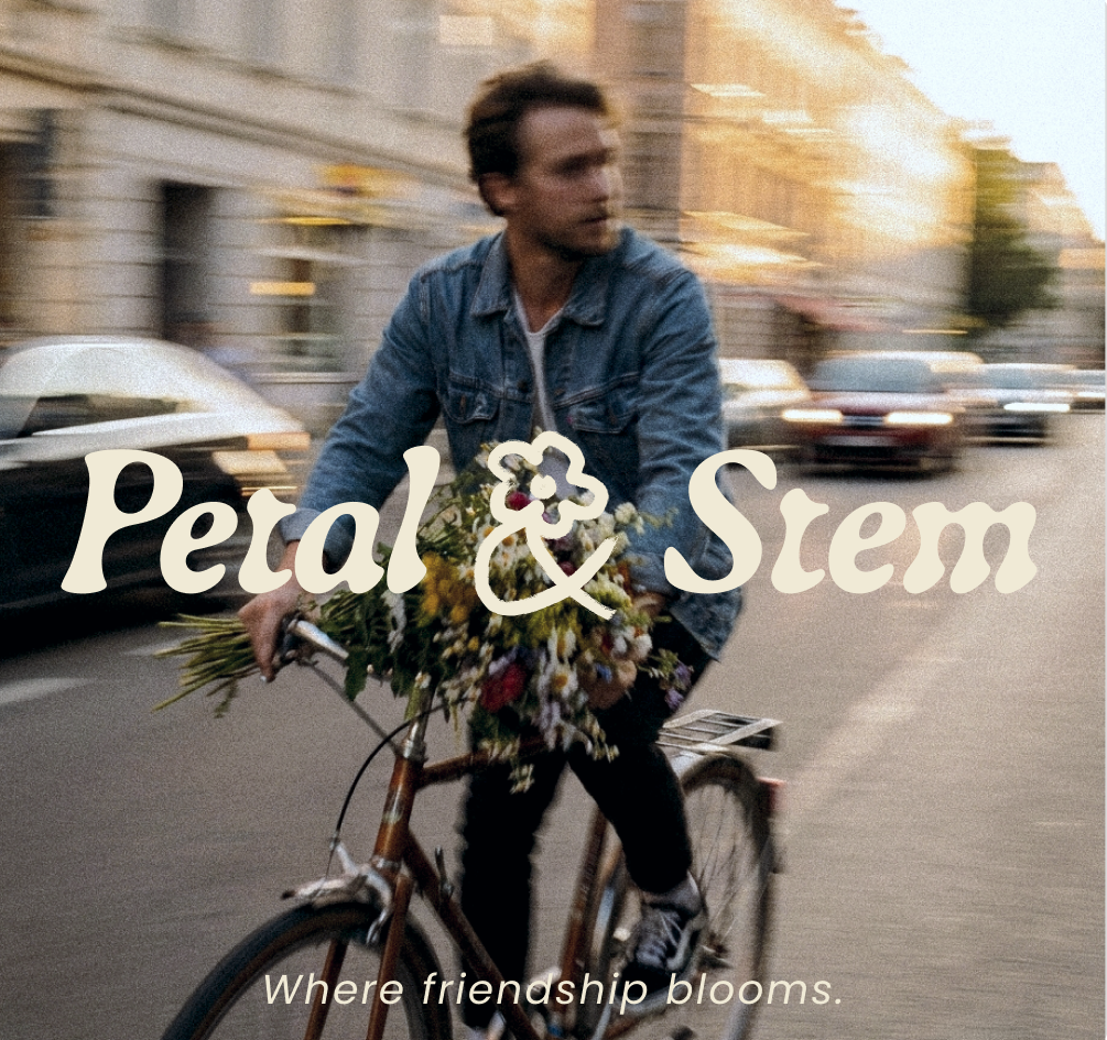
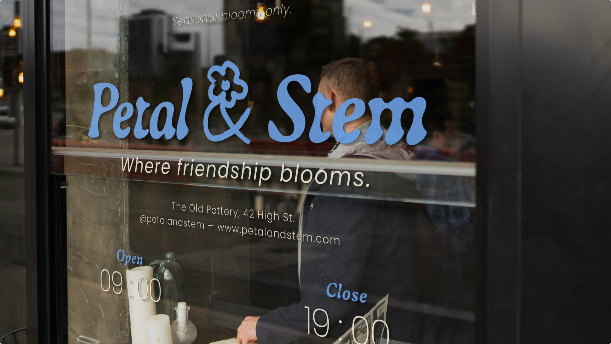
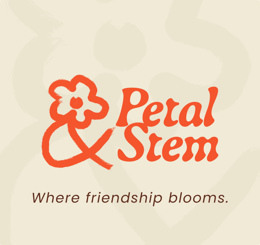
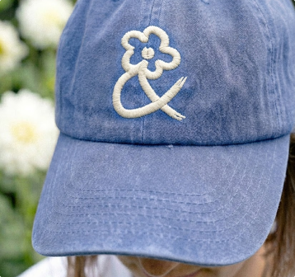
At the core of this identity is a typographic concept centered around a single elegant idea: the ampersand as a living thing. Utilizing the Gaya typeface, carefully chosen for its organic letterforms and reference to the Earth goddess, I designed a custom logo. The top loop of the ampersand naturally opens into a flower, while the lower curves reach out like winding stems. This intricate typographic detail perfectly symbolizes the deep, intertwined bond between the two founders.
The Visual Vibe
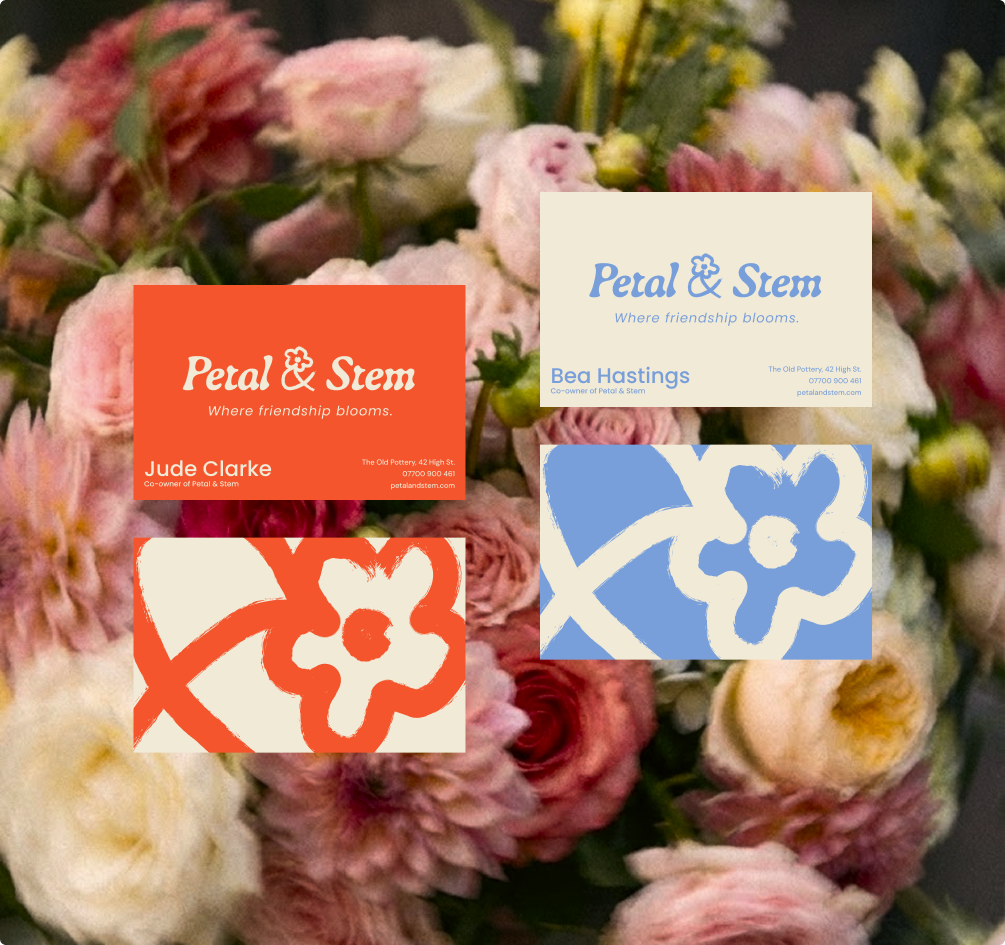
The visual language leans heavily into this naive approach, utilizing hand-drawn illustrations with visible brushstrokes to establish a warm, approachable presence. The palette, pulling terracotta orange, scabious blue, and oatmeal cream directly from seasonal flowers, creates a striking contrast. A key narrative detail lies in the founders' business cards, which carry distinct colors taken from opposite sides of the color wheel. Two people, one unified brand.


"[Insert inspirational catchphrase here to lure potential clients]"
Contact me
Contact
l4nc@gmail.com
Pages
Home
Projects
Blog
About me
Contact
Social
Tapp.it
Dribbble

2026 L4NC_StudioⒹ All Rights Reserved
Petal & Stem
Art direction
Illustration
The Challenge & Concept
The brief for Petal & Stem called for a visual identity for an independent florist built entirely on friendship and strictly seasonal British blooms. To capture this unpretentious and joyful energy, I developed a "Modern Naive" art direction. It deliberately steps away from polished, traditional floristry clichés to create a grounded, confident brand that celebrates craft and human connection. This specific vision and execution led the project to be highlighted in a dedicated feature by Creative Boom.
Typographic Thinking
At the core of this identity is a typographic concept centered around a single elegant idea: the ampersand as a living thing. Utilizing the Gaya typeface, carefully chosen for its organic letterforms and reference to the Earth goddess, I designed a custom logo. The top loop of the ampersand naturally opens into a flower, while the lower curves reach out like winding stems. This intricate typographic detail perfectly symbolizes the deep, intertwined bond between the two founders.
The Visual Vibe
The visual language leans heavily into this naive approach, utilizing hand-drawn illustrations with visible brushstrokes to establish a warm, approachable presence. The palette, pulling terracotta orange, scabious blue, and oatmeal cream directly from seasonal flowers, creates a striking contrast. A key narrative detail lies in the founders' business cards, which carry distinct colors taken from opposite sides of the color wheel. Two people, one unified brand.

"[Insert inspirational catchphrase here to lure potential clients]"
Contact me
Contact
hello@l4nc.com
Pages
Home
Projects
Blog
About me
Contact
Social
Tapp.it
Dribbble

2026 L4nc_StudioⒹ All Rights Reserved