Home

Projects
Blog
About me
Contact
Silva
Art direction
The Concept & Visual Identity
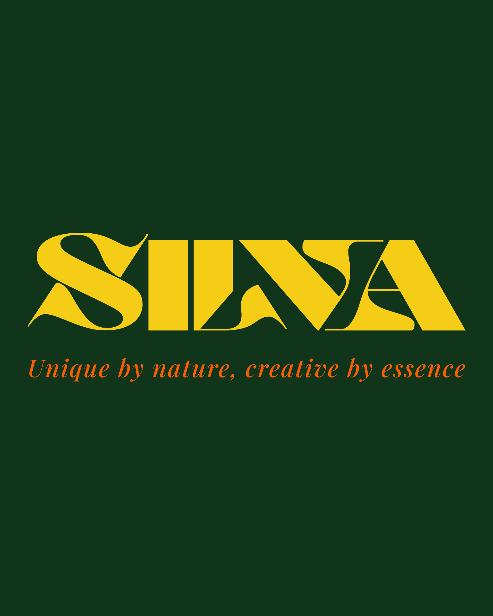
For this Boom Brief, the challenge was to craft a premium alcohol-free spirit inspired by the quiet power of nature. I deliberately steered clear of the typical transparent aesthetics to focus entirely on depth and visual richness. The identity is anchored by a warm amber core and the Kerozene typeface. Its organic curves echo deep forest roots, bringing a tactile quality to the wordmark. Paired with a minimal forest green label, it establishes SILVA as a rooted, sophisticated brand designed for a complex sensory experience.
Art Direction & Staging
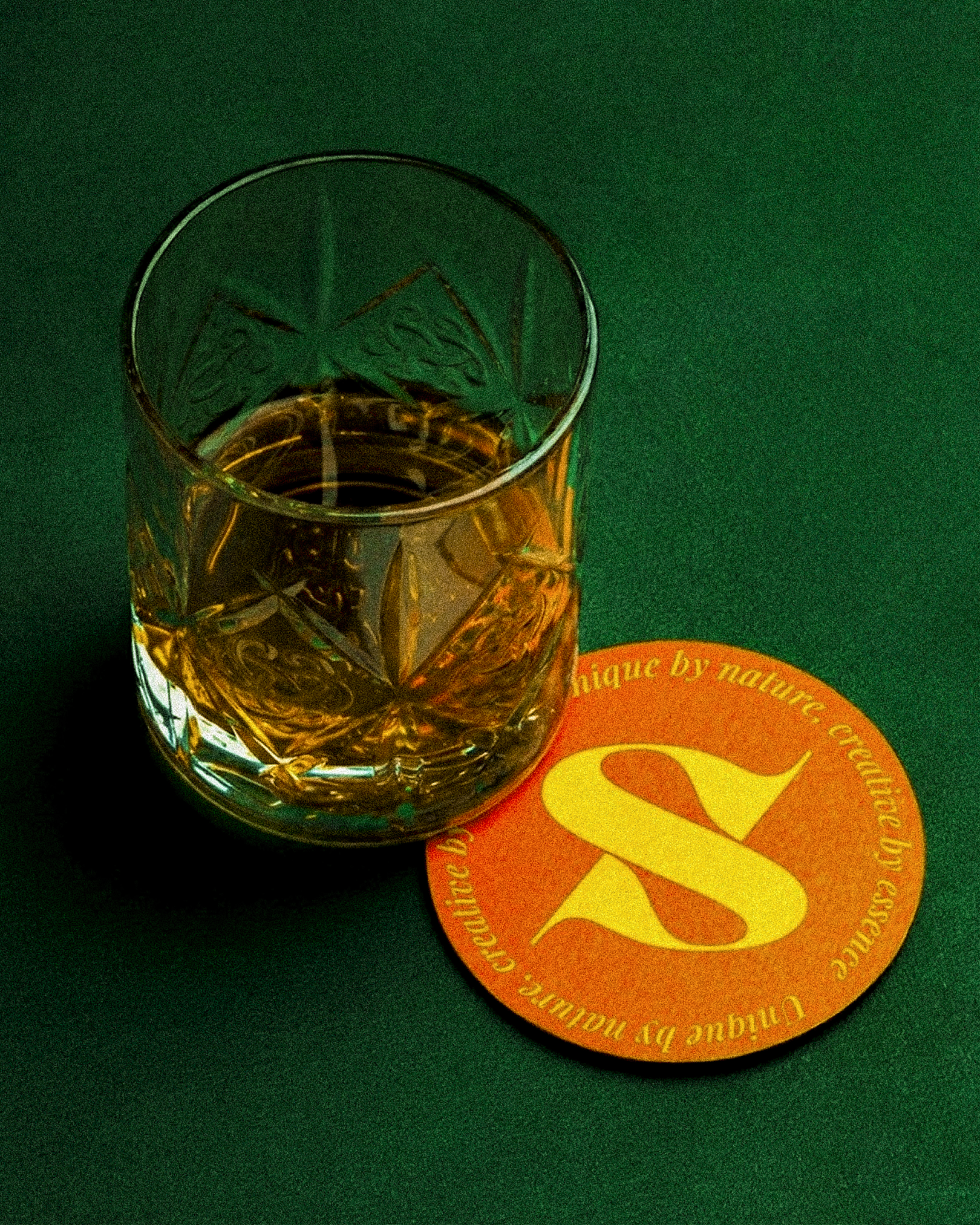
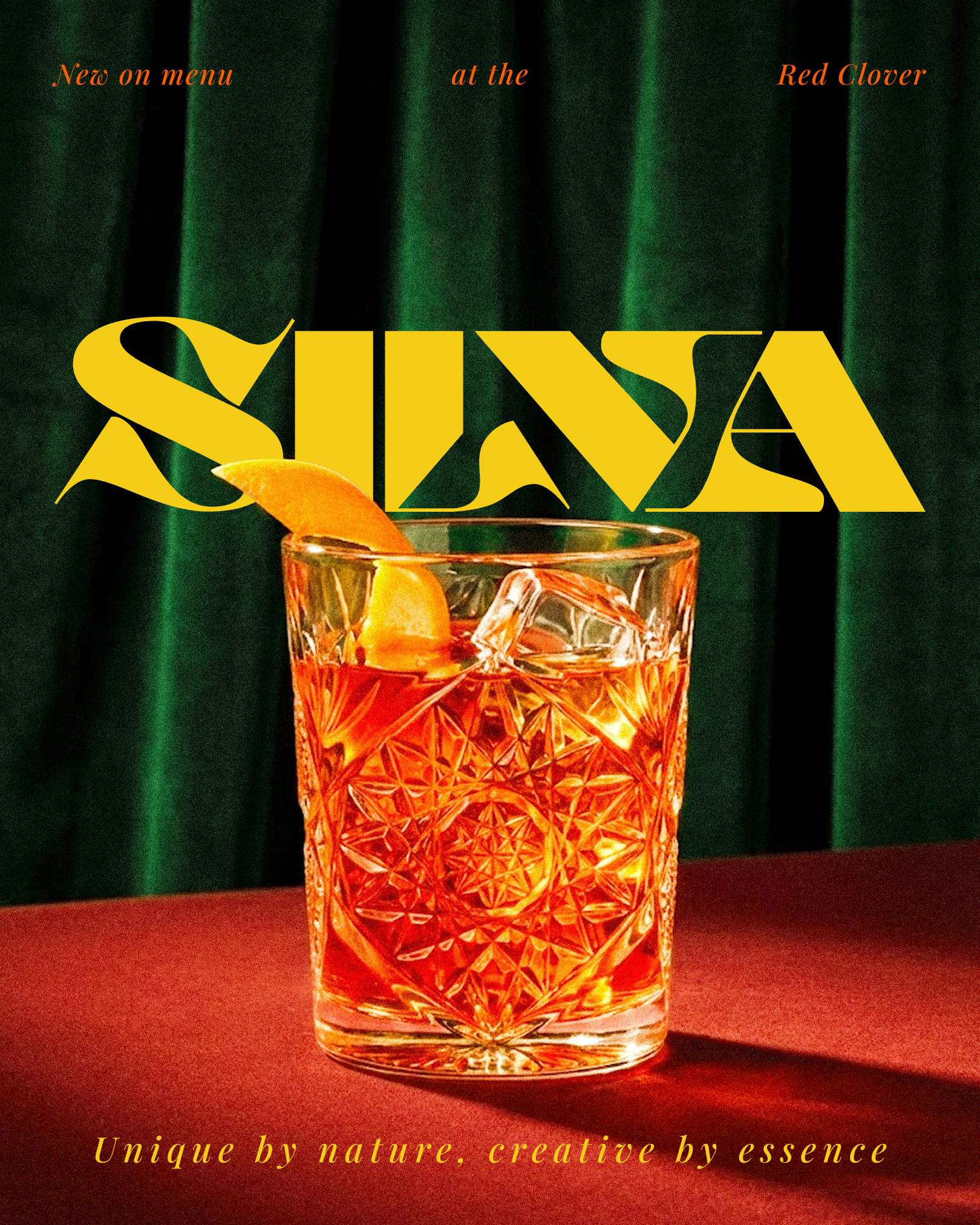
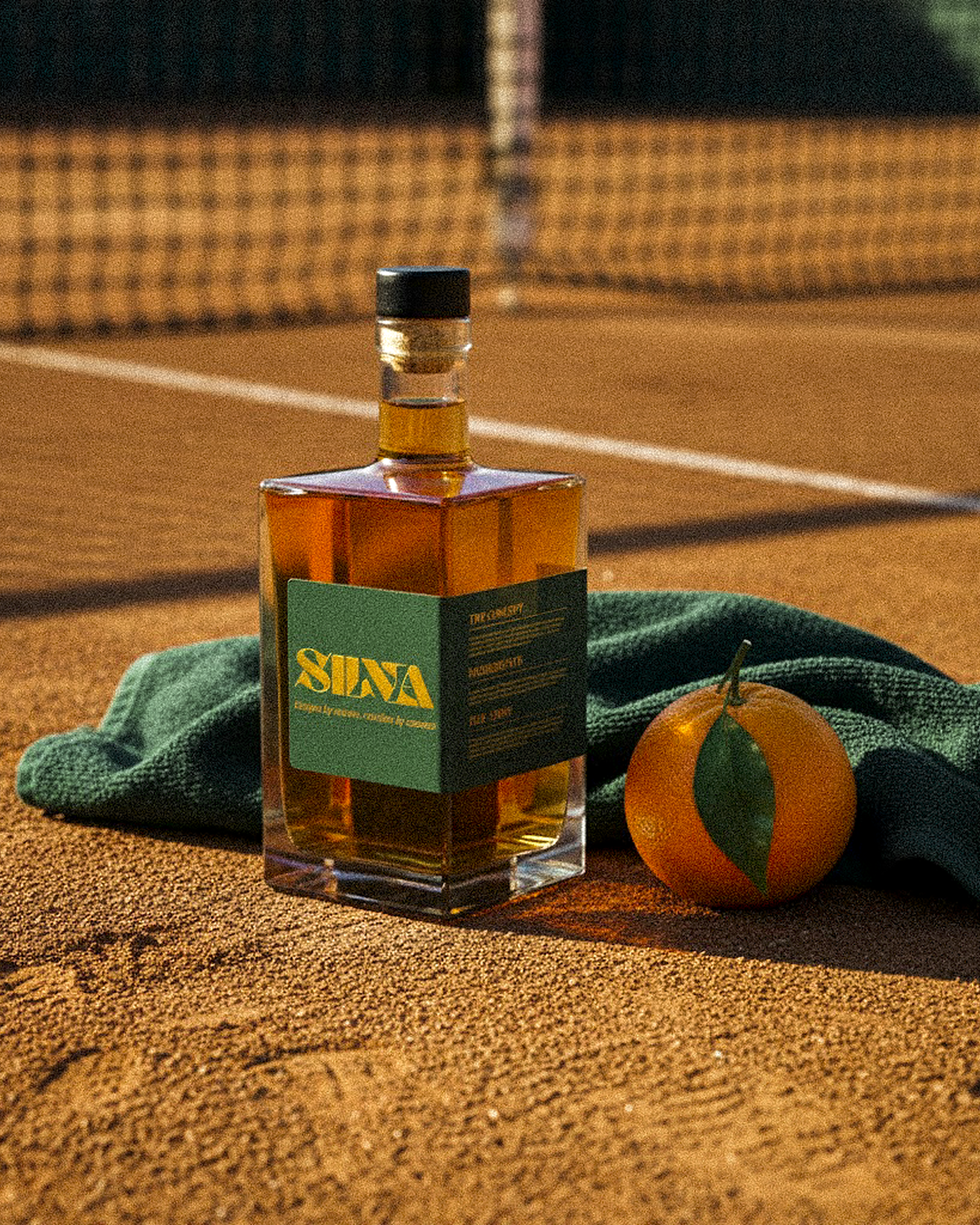
The staging and art direction are fundamentally crucial to the brand narrative. By placing the bottle on a textured red clay surface, the resulting imagery captures a distinct moment of clarity and pause after the chaos of the game. The stark visual contrast between the raw, porous clay texture and the highly refined, reflective glass reflects the exact balance modern creatives constantly crave. Ultimately, SILVA is a brand that truly lives up to its core philosophy: unique by nature, creative by essence.


"[Insert inspirational catchphrase here to lure potential clients]"
Contact me
Contact
l4nc@gmail.com
Pages
Home
Projects
Blog
About me
Contact
Social
Tapp.it
Dribbble

2026 L4NC_StudioⒹ All Rights Reserved
Silva
Art direction
The Concept & Visual Identity
For this Boom Brief, the challenge was to craft a premium alcohol-free spirit inspired by the quiet power of nature. I deliberately steered clear of the typical transparent aesthetics to focus entirely on depth and visual richness. The identity is anchored by a warm amber core and the Kerozene typeface. Its organic curves echo deep forest roots, bringing a tactile quality to the wordmark. Paired with a minimal forest green label, it establishes SILVA as a rooted, sophisticated brand designed for a complex sensory experience.
Art Direction & Staging
The staging and art direction are fundamentally crucial to the brand narrative. By placing the bottle on a textured red clay surface, the resulting imagery captures a distinct moment of clarity and pause after the chaos of the game. The stark visual contrast between the raw, porous clay texture and the highly refined, reflective glass reflects the exact balance modern creatives constantly crave. Ultimately, SILVA is a brand that truly lives up to its core philosophy: unique by nature, creative by essence.

"[Insert inspirational catchphrase here to lure potential clients]"
Contact me
Contact
hello@l4nc.com
Pages
Home
Projects
Blog
About me
Contact
Social
Tapp.it
Dribbble

2026 L4nc_StudioⒹ All Rights Reserved