Home

Projects
Blog
About me
Contact
Sol Origin
Art direction
The World-Building
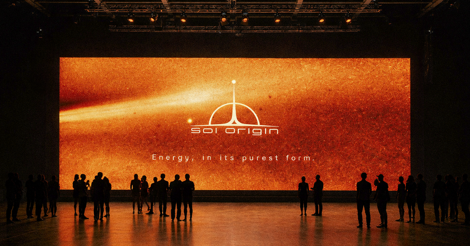
In 2500, humanity has outgrown terrestrial borders to industrialize the entire Solar System. The era of traditional nations is gone, replaced by monumental megacorporations. Each claims absolute dominion over a specific celestial body to exploit its unique capabilities. Born from my deep personal passion for astronomy and space exploration, this fictional project marks the inaugural chapter of a comprehensive planetary branding series, beginning at the center of our orbital architecture: the Sun.
The Fictional Brief
Sol Origin is the colossal corporate infrastructure holding exclusive rights to stellar harvesting. Its mission is not to manufacture energy, but to capture it directly at its fundamental source to power the rest of the system. The brief demanded a visual identity embodying absolute, almost divine control. The branding needed to project an aura of unwavering stability, juxtaposed with the overwhelming heat of the star they command.
The Art Direction
Translating the immense scale of stellar harvesting into a cohesive visual system required a delicate balance between primal force and clinical precision. The art direction focuses on the sheer magnitude of the operation. Every graphical element is meticulously engineered to reflect the brutalist efficiency of human engineering attempting to cage a star. I stripped away all superfluous ornamentation to focus purely on function, authority, and monumental scale.
The Logo
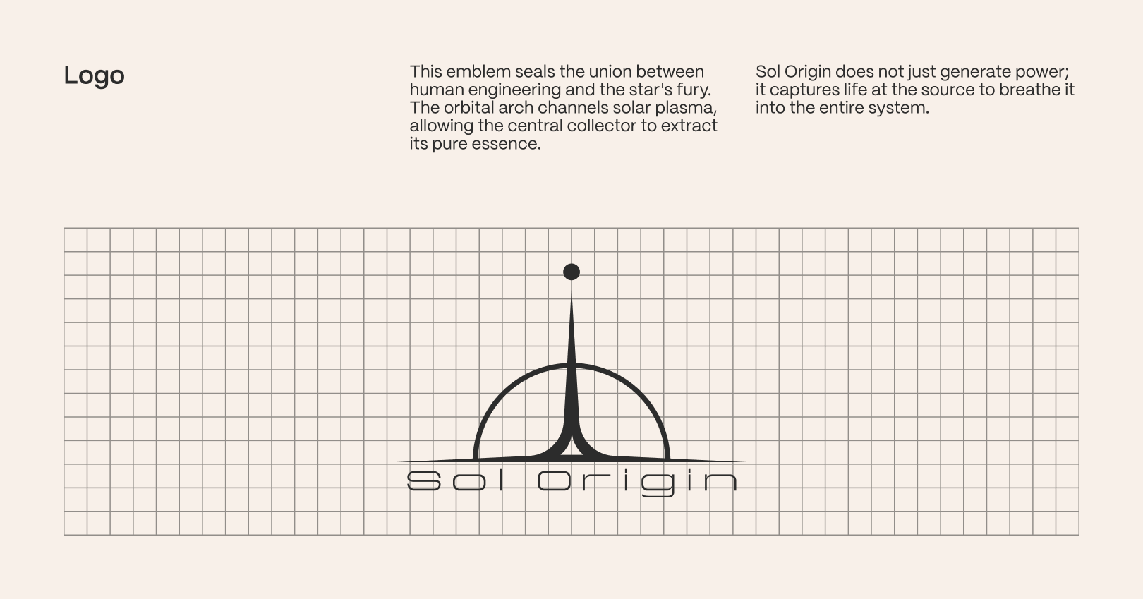
The central emblem directly translates this visual strategy. It seals the definitive union between human ambition and the star's untamed fury. The sweeping orbital arch graphically channels the solar plasma rather than blocking it, directing the eye toward the central collector that extracts its pure essence. This geometric symbol ensures the brand communicates total dominance and technological supremacy across every touchpoint.
The Colors
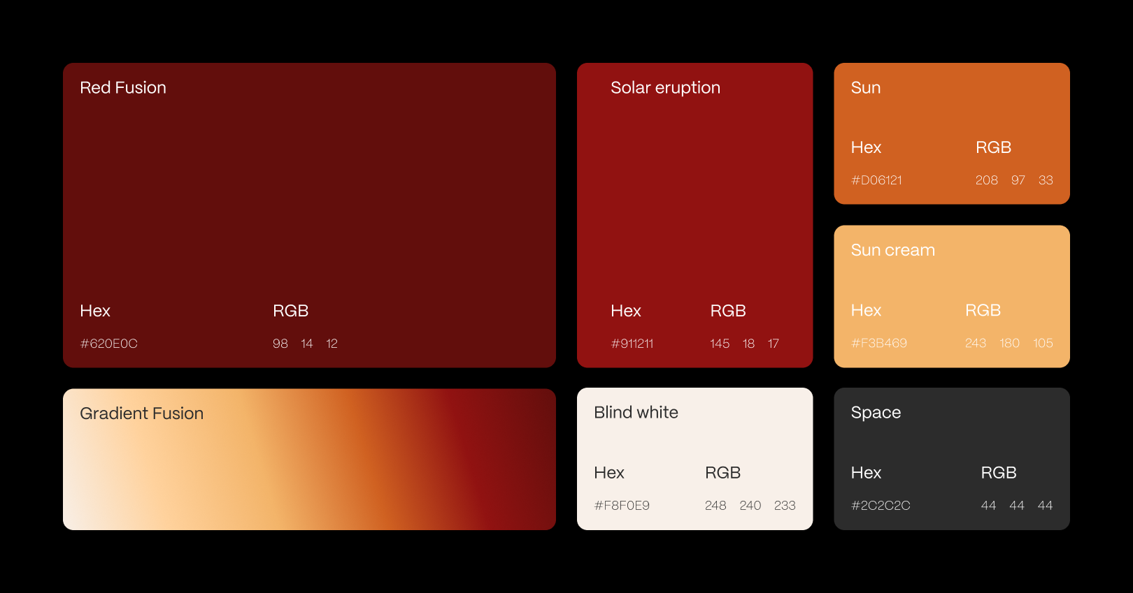
To fully anchor this megacorporation's identity, the color palette relies on a harsh, unforgiving contrast. Red Fusion embodies the torrid, untamed, and dangerous nature of raw solar plasma. This is immediately counterbalanced by Blind White, representing the clinical, heat-shielded aesthetics of orbital technology. This chromatic tension perfectly summarizes the Sol Origin mandate: cold logic applied to burning chaos.
The Typography
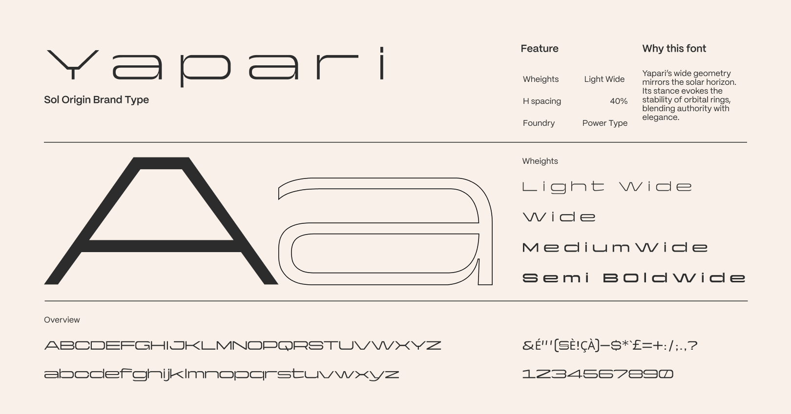
Finally, to support this monumental brand, the Yapari typeface was selected as its structural foundation. Its notably wide geometry directly mirrors the vastness of the solar horizon. Its strict rigidity evokes the immense orbital rings, flawlessly blending industrial authority with corporate elegance. It finalizes the identity by providing the necessary weight and gravitas for an entity governing our system.


"[Insert inspirational catchphrase here to lure potential clients]"
Contact me
Contact
l4nc@gmail.com
Pages
Home
Projects
Blog
About me
Contact
Social
Tapp.it
Dribbble

2026 L4NC_StudioⒹ All Rights Reserved
Sol Origin
Art direction
The World-Building
In 2500, humanity has outgrown terrestrial borders to industrialize the entire Solar System. The era of traditional nations is gone, replaced by monumental megacorporations. Each claims absolute dominion over a specific celestial body to exploit its unique capabilities. Born from my deep personal passion for astronomy and space exploration, this fictional project marks the inaugural chapter of a comprehensive planetary branding series, beginning at the center of our orbital architecture: the Sun.
The Fictional Brief
Sol Origin is the colossal corporate infrastructure holding exclusive rights to stellar harvesting. Its mission is not to manufacture energy, but to capture it directly at its fundamental source to power the rest of the system. The brief demanded a visual identity embodying absolute, almost divine control. The branding needed to project an aura of unwavering stability, juxtaposed with the overwhelming heat of the star they command.
The Art Direction
Translating the immense scale of stellar harvesting into a cohesive visual system required a delicate balance between primal force and clinical precision. The art direction focuses on the sheer magnitude of the operation. Every graphical element is meticulously engineered to reflect the brutalist efficiency of human engineering attempting to cage a star. I stripped away all superfluous ornamentation to focus purely on function, authority, and monumental scale.
The Logo
The central emblem directly translates this visual strategy. It seals the definitive union between human ambition and the star's untamed fury. The sweeping orbital arch graphically channels the solar plasma rather than blocking it, directing the eye toward the central collector that extracts its pure essence. This geometric symbol ensures the brand communicates total dominance and technological supremacy across every touchpoint.
The Colors
To fully anchor this megacorporation's identity, the color palette relies on a harsh, unforgiving contrast. Red Fusion embodies the torrid, untamed, and dangerous nature of raw solar plasma. This is immediately counterbalanced by Blind White, representing the clinical, heat-shielded aesthetics of orbital technology. This chromatic tension perfectly summarizes the Sol Origin mandate: cold logic applied to burning chaos.
The Typography
Finally, to support this monumental brand, the Yapari typeface was selected as its structural foundation. Its notably wide geometry directly mirrors the vastness of the solar horizon. Its strict rigidity evokes the immense orbital rings, flawlessly blending industrial authority with corporate elegance. It finalizes the identity by providing the necessary weight and gravitas for an entity governing our system.

"[Insert inspirational catchphrase here to lure potential clients]"
Contact me
Contact
hello@l4nc.com
Pages
Home
Projects
Blog
About me
Contact
Social
Tapp.it
Dribbble

2026 L4nc_StudioⒹ All Rights Reserved